PythonPlotting
From Yade
Creating simple plots with python
Warning: This page is about an experimental feature; it was written for SVN revision 1355 and due to rapid interface changes may not be up-to-date.
We will use SimpleScenePython as example and describe only the differences that are needed for plots (the full code is here)
First, import yade.plot module. It uses matplotlib internally; you need to have it installed (in Debian-based systems, the package is called python-matplotlib). <source lang="python"> import yade.plot </source>
We need to add engine for collecting data to the list of engines. <source lang="python"> o.engines=[
      ### ...
      StandAloneEngine('PlotDataGetter',{'timeInterval':.01,'addPlotDataCall':'myAddPlotData()'})
]
</source>
The attribute timeInterval specifies initial interval at which data will be recorded; if there is too many data, their quantity may be halved and timeInterval doubled. addPlotDataCall is python code that will be executed when the engine decides data need to be collected. In this case, it is the function myAddPlotData() that will be called; and we need to define it:
<source lang="python">
def myAddPlotData():
sph=o.bodies[1]
yade.plot.addData({'t':o.time,'i':o.iter,'z_sph':sph.phys['se3'][2],'v_sph':sph.phys['velocity'][2]})
</source>
yade.plot.addData will add sampled data to arrays that will be plotted. The dictionary is keyed by label and the value is value that you want to store; the value will be evaluated at the moment data is collected; it can be simple variable or an expression as complex as you like (like distance of 2 bodies, relative angular velocity, etc.).
Last thing is to specify what plots do we want.
<source lang="python">
yade.plot.plots={'i':('t'),'t':('z_sph',('v_sph','g^'))}
</source>
The static variable yade.plot.plots is dictionary keyed by the x-axis variable (label): you will get as many plots as there is items in the dictionary.
The value is tuple containing
- either simple label
- or a 2-tuple of (label,style), where style (details) may specify color and shape of points:
g^is for green triangle etc. Matplotlib is mostly-compatible with Matlab plotting, you can get your inspiration there. For every label/(label,style), you will obtain extra function that will be plotted in this graph.
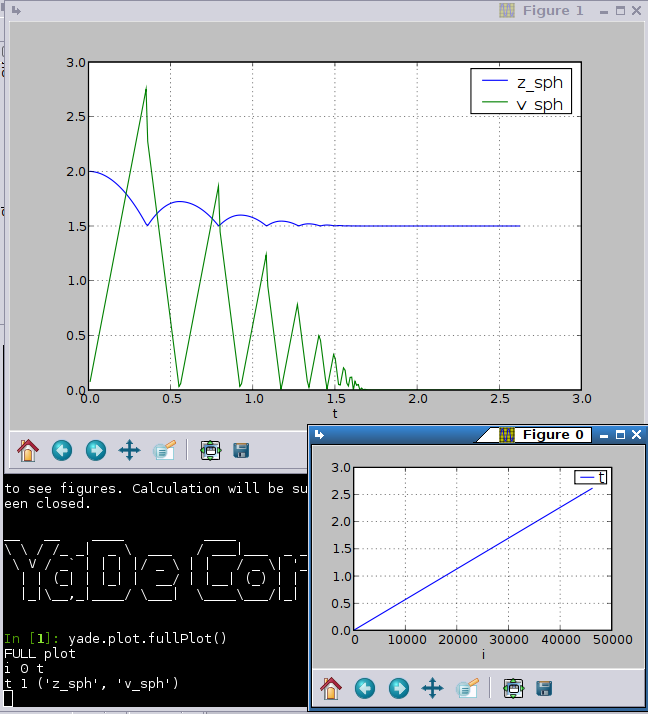
In the example above, we will therefore get 2 figures, where
- the first figure will plot t as function on i;
- the second figure will plot z_sph (as continuous line) and v_sph (as green triangles) as functions of t.
Then you can start the calculation with o.run() and after a while (to collect some data), you can type
<source lang="python">
yade.plot.show()
</source>
to get your plots.
Displaying figures will, unfortunately, suspend the computation until all figure windows will have been closed (due to some subtle threading issues not yet fully understood).
